Enhanced Perception
Basic charts don't scale. We empower people to more easily understand complex situations by designing profoundly visual information systems. Here are some examples from our blog below.

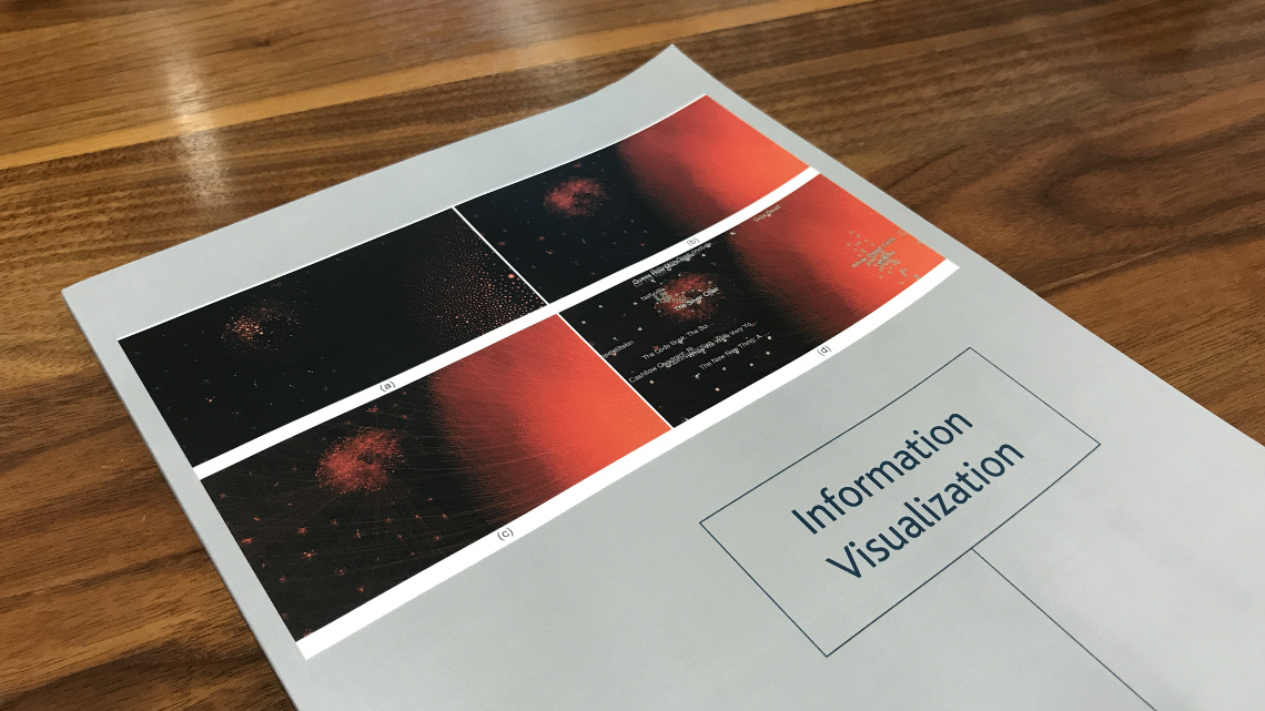
An Uncharted research product for the visual analysis of massive graph data is featured in the pages and on the cover of the latest issue of Information Visualization, a leading peer-reviewed journal on the study and application of information visualization.
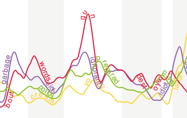
While sentiment analysis on Twitter data has become commonplace, Uncharted’s Richard Brath got us thinking about going deeper and looking at the emotional content.
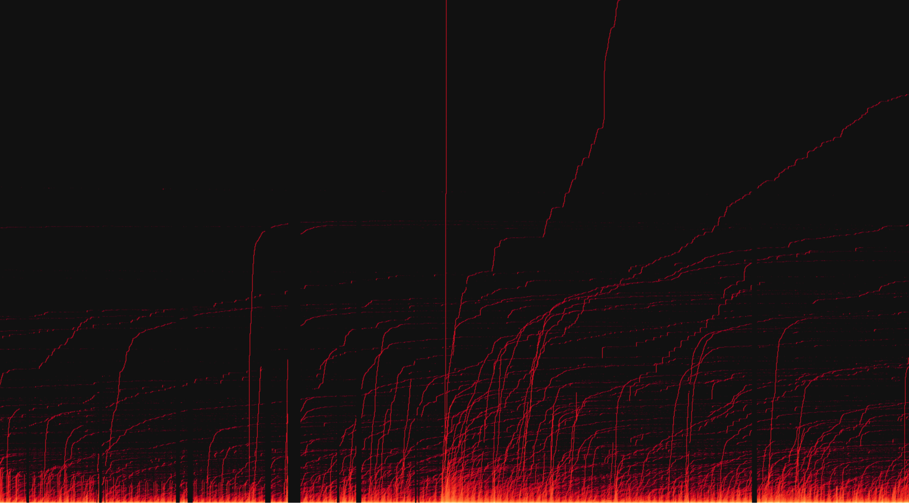
Last summer we began tracking tweets that mention Donald Trump in preparation for our talk at Strata NY. We’ve continued monitoring the topic and, as of March 3rd 2016, we’ve processed over 91 million tweets.
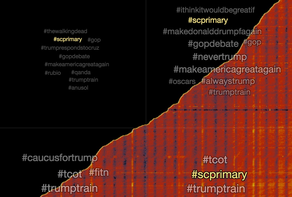
In our ongoing analysis of tweets about Donald Trump we pulled together 27 million tweets in the month of February from 3.7 million unique users. It seems like everyone is joining the conversation in different ways.