High-Performance Engineering
Big Data is messy. We build distributed, AI-enhanced pipelines to transform billions of data points into visual insights in real time. Here are some examples from our blog below.

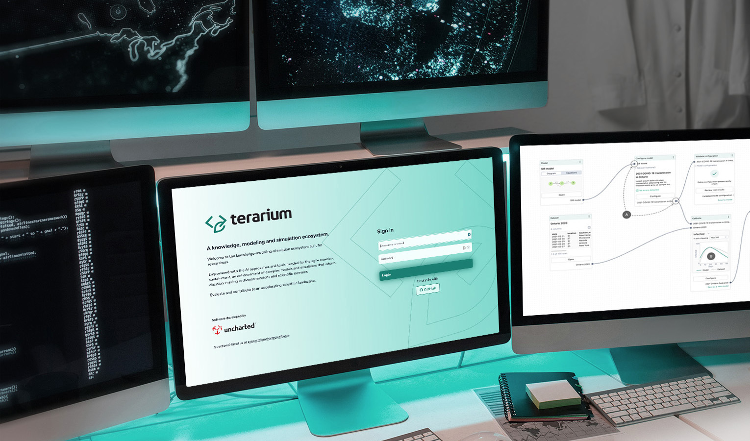
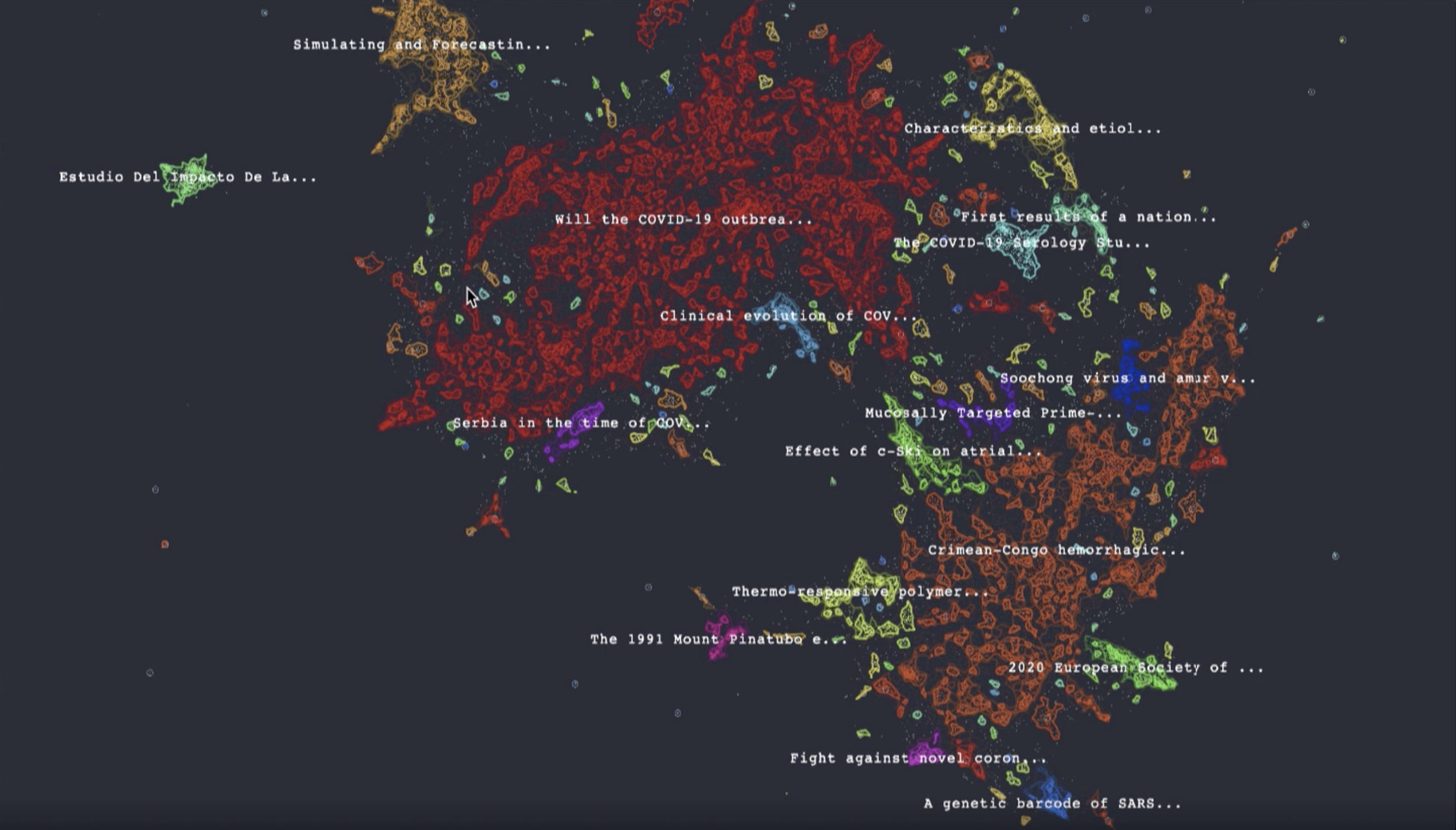
In a crisis like a pandemic, time stands still. The “open science” movement rallies to offer predictive models, but understanding and extending complex model code requires deep expertise and takes weeks at best, especially when there’s little transparency into the original intent and assumptions.

Uncharted has been working on applications of knowledge-graph augmented Retrieval-Augmented Generation (RAG) for months now and couldn’t be more excited about its potential.

Is your holiday wish list full of eco-friendly gadgets? Even if you’ve been decidedly nice, supply chain fragility may impact what ends up under your tree.
It’s time again for IEEE VisWeek, and Uncharted is excited to be on hand both as a sponsor of the VIS Diversity/Inclusivity Scholarships and a presenter of three new peer-reviewed research papers.
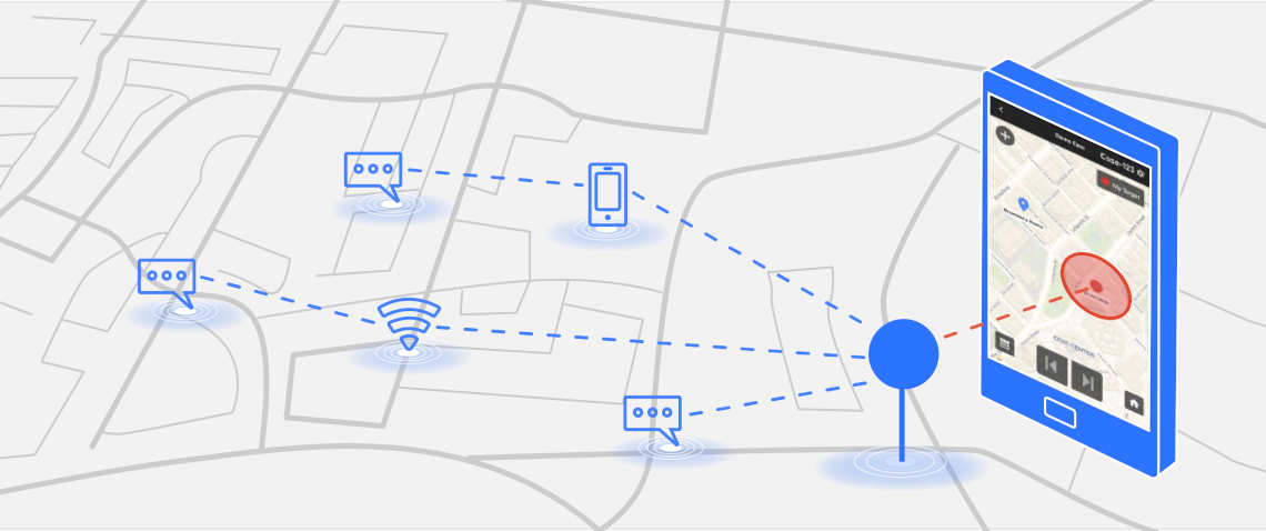
We’re excited to introduce GeoTime Live, a new crime-fighting tool that lets investigators use any device to instantly map live ping emails. GeoTime Live has already been successfully used in exigent scenarios for cases related to narcotics, homicide, fugitive, kidnappings, Amber Alerts, Silver Alerts, despondents and dispatch.