
Even as governments attempt to manage COVID-19 and distribute highly sought-after vaccines, hurdles have surfaced and frustration has understandably mounted. As new variants emerge, many are left wondering what more can be done to contain further outbreaks while a socially distanced world undertakes the time-consuming process of building immunity. Questions have highlighted that broad-strokes policy making may not always appear to align with local, everyday observations. This seeming disconnect has led to a public outcry for more clarity into the data behind decisions with such high costs. With some of these problems in mind, we conducted a small experiment to see how we might enable visualization tools for outbreak analysis. Specifically, we wanted to see if it was possible to visualize—anonymously and at a hyperlocal level—how citizens responded to stay-at-home orders from local and federal governments. If so, could displaying hyperlocal mobility trends both inform pandemic analysis and response efforts and help the general public understand how and why COVID restrictions were enacted to ensure health and safety?
Last year, we put together “Aspects,” an interactive visualization prototype to explore whether aggregate mobility data from the early stages of the COVID-19 pandemic could be used to answer these questions. Specifically, we used several terabytes of anonymized mobility data from April 2020 provided to us for COVID use by Veraset. Taking inspiration from previous visualization research with other types of data and our own SALT library, we built a prototype that allows us to display population-scale movements in time and space on a web-based map. With multi-resolution map tile displays, inferred metrics and contextual overlays, the prototype gave us a glimpse into how successful stay-at-home orders were.
In our technical infrastructure, the data was first passed through custom pipelines written in Go for cleaning, normalization and enrichment. Redis was used as an in-memory state store to save intermediate results between the pipeline’s data transformation stages. Finally, the data was written to a hierarchy of geotemporal map tiles, using Protobuf as a contract between our Go backend pipeline and the JavaScript frontend.
For our research, we chose a sample of data in New York City from April 5–12, 2020 when the city was just reaching the peak of its first wave. The base layer visualized is a heatmap aggregation of populations across the city visiting different neighborhoods. A timeline below the map indicates when the public migrated over time and also lets us filter the map to view specific time ranges. Viewing data by time can help us make sense of basic mobility patterns (night vs. day), holiday travel and—we theorized—how people heed changes in public health requirements.
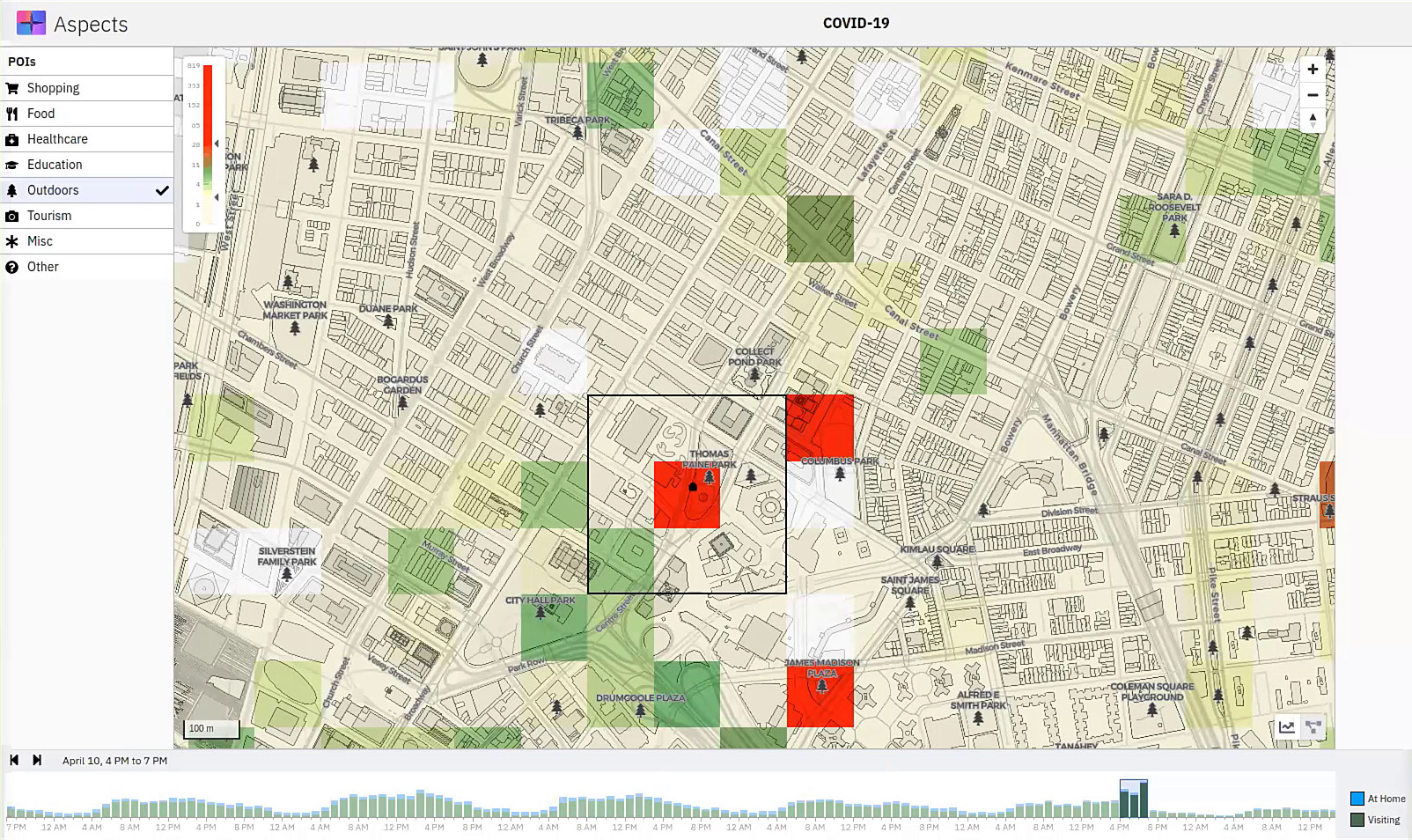
Heatmap of lower Manhattan with the timeline filtered to depict April 10 from 4 PM to 7 PM. Darker green and red areas are locations with high activity.
Zooming in to the map reveals that while there seem to be few visits to residential areas, there are a number of other locations with high activity. Several map overlays can provide context to understand why. Point of interest (POI) markers for various types of locations (shopping, food, healthcare, outdoors, tourism, etc.) can help reveal the nature of high-traffic areas. Given that we were working with mobility data during the spring, we confirmed some broad intuitions, namely, that outdoor areas such as parks were particularly popular destinations for congregations of ‘visitors’.
In our Aspects prototype, selecting a location also surfaces a time-series matrix of estimated visitor trends for adjacent neighbourhoods. Disease spread is inherently a spatial phenomenon, with clusters of infections often spreading across contiguous neighbourhoods, especially when mobility is high. In this light, we thought that examining mobility trends across sets of adjacent tiles could be a useful feature for downstream analysis.
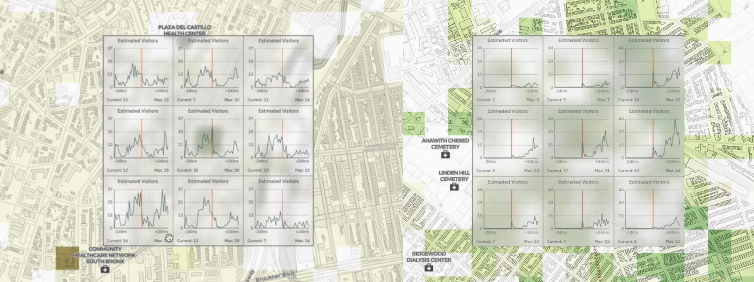
A 3x3 matrix overlay surfaces temporal trends around the central tile of interest.
Once areas of public congregation are identified, mobility inflows and outflows can be analyzed . A “threads” layer can be toggled that, for the selected location, shows where visitors came from or where they went next. A sidebar lists the top originating or destination neighborhoods along with their COVID case counts a week before and a week after the visits. This provides a high-level comparison of mobility with respect to disease spread, and opens up analytic space for examining correlations between mobility and infection rates. In general, we found that while residential neighborhoods showed little mobility, parks attracted visitors from all areas of the city. Ultimately, understanding areas where people congregate and where they travel could be a very useful tool for policy makers to both create better pandemic decisions and effectively communicate those changes to the general public.
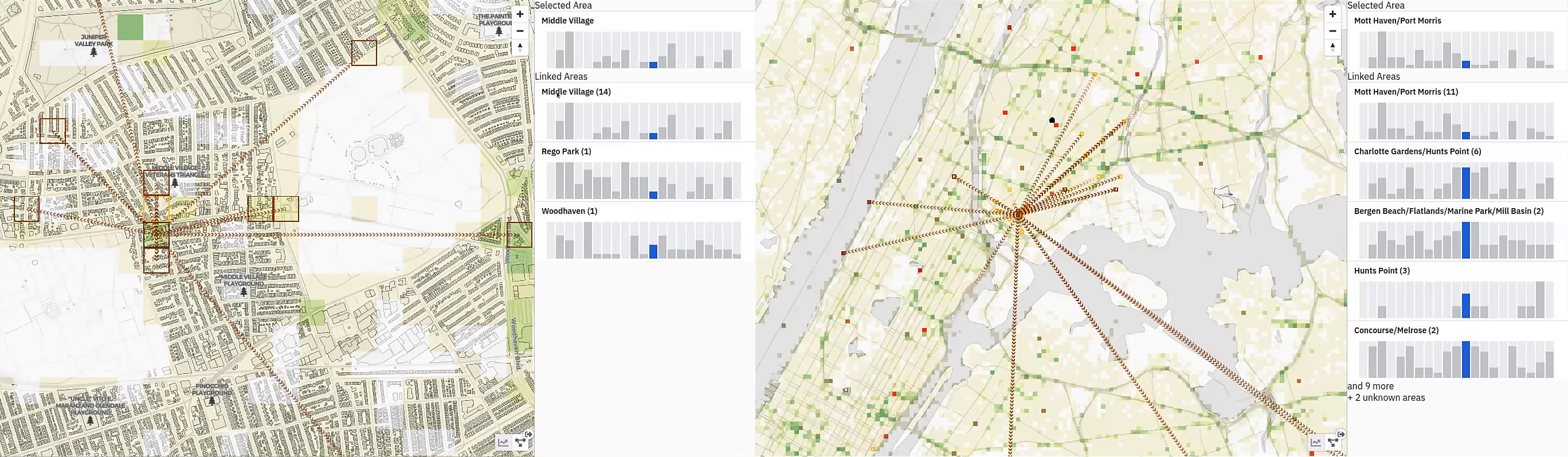
Residential neighborhoods (left) tend to show little mobility, while parks (right) often draw visitors from other boroughs.
In addition to visualizing anonymized, aggregate mobility data in times of social distancing, we continue to work on a number of separate research threads related to COVID-19. Among these is our effort for DARPA’s Automated Scientific Knowledge Extraction (ASKE) program, where we are building a visual modeling platform for exploring, analyzing, augmenting and executing a range of scientific models, from molecular models of the COVID-19 virus to epidemiological models around disease spread. For more information see Towards a Paradigm for Visual Modeling.
Related research:
Acknowledgments
The development team for the COVID-19 Aspects prototype was Sean McIntyre, Dario Segura and Fahd Husain with support from Adamo Carolli and guidance from David Jonker.
This post was written by Michael Crouch and Fahd Husain with editorial assistance from David Jonker.