One of the questions we've spent a lot of time pondering over the years is a deceptively simple one:
How do we visualize billions of data points?
To understand why this is a difficult question to answer, let’s look at two popular approaches. Fundamental to both is the (correct) assumption that one cannot simply ship billions of data points over a network connection and draw them on a web front-end.
Approach #1: Regional Aggregation
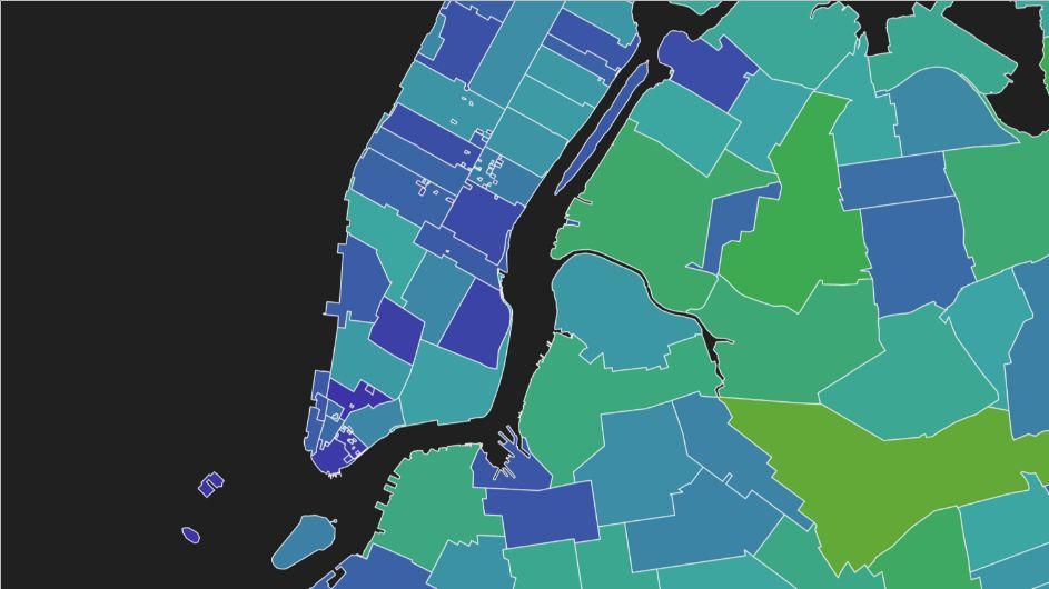
One way to deal with large volumes of data is to employ spatial aggregation. Regions are defined and values existing within those regions are aggregated using a mathematical function (such as the mean() value within each region). Unlike the following approach, this method does actually visualize the full dataset, albeit at a reduced resolution.
Unfortunately, while regions might be political, geographic or arbitrary, they do not necessarily line up well with the source data. The above visualization, known as a Choropleth Map, might be very suitable for answering some analytical questions regarding census data, for example, but would not accurately represent information about traffic accidents - especially if a problematic intersection fell on the boundary of one of the regions. More importantly, if our data was significantly more dense and localized than the regions, we’d need a better way to explore it.
Approach #2: Sampling
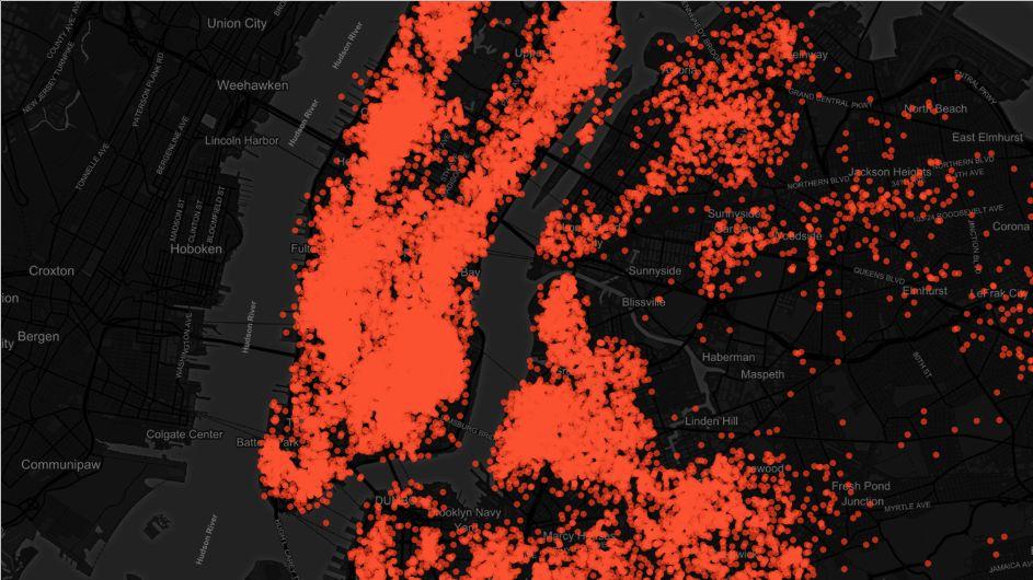
Another approach to making large datasets more manageable for visualization is to reduce the number of data points down to a representative subset, something often accomplished via random sampling. Then the subset is plotted as above.
Since we’re no longer aggregating by region, we do get some sense of data distribution. We’ve also increased the amount of data we’re rendering from less than 100 data points to 20k. Unfortunately, the visualization suffers heavily from over-plotting and it is difficult to get a sense of data density in areas such as Manhattan, where many points overlap. Adding another 80k points would likely not allow us to see more information or draw superior conclusions.
How do we visualize billions of data points (meaningfully)?
This is where Uncharted Salt comes in.
Rather than showing hundreds or tens of thousands of values, Salt allows you to explore your entire dataset by utilizing Apache Spark and a multi-scale approach to visualization.
Above, we’ve plotted taxi pickup locations from the popular NYC Taxi Dataset.
Just as we saw in Approach #1, Salt applies regional aggregation, but uses pixels as regions. This allows for a visualization which is aggregated to the pixel density of the display device - showing exactly as many data points as your screen can support! This means that Salt can capture all the advantages of Approach #2 as well, without suffering from over-plotting.
At a high level, we can see that the data defines roadways and interesting features like Central Park. There is also a blurring effect in the Theater District which is a result of GPS error. Furthermore, we can zoom and pan the visualization to interactively de-aggregate regions we are interested in for a closer look. For example, three distinct hot-spots are visible at LaGuardia airport, where there are prescribed taxi pickup lines.
Salt Applications
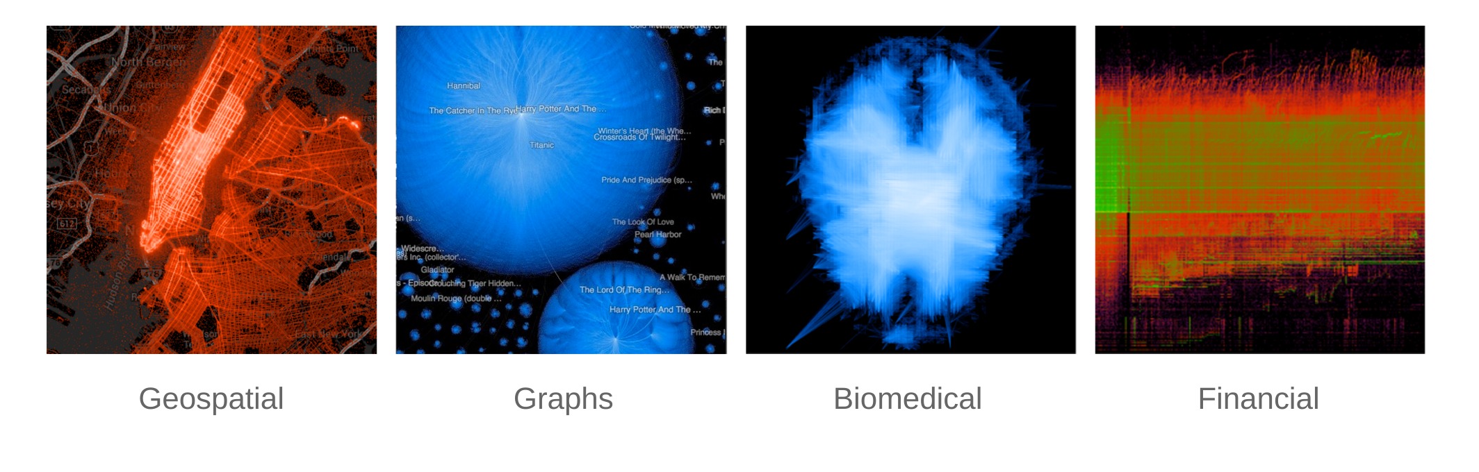
We’ve been able to apply this technology to a variety of visualization problems over the years, including:
- Heatmaps
- Hierarchical charts
- Mountain plots
- Analytic overlays
- Line visualizations
- Graph visualizations
- On-demand visualization generation
- etc.
Try it yourself!
After several API revisions, and lots of testing, we’re opening the core library for everyone to use. You can find it on GitHub, or include it directly into your projects using gradle:
compile "software.uncharted.salt:salt-core:2.0.0"
or maven:
<dependency>
  <groupId>software.uncharted.salt</groupId>
  <artifactId>salt-core</artifactId>
  <version>2.0.0</version>
</dependency>
A good starting point is the salt-examples repository, which includes several example projects showcasing various types of Salt visualizations. Try it yourself, and let us know what you think. We’ll be releasing more examples in the coming months, as well as additional blog posts showcasing interesting Salt use cases and code examples.