Uncharted Research
Visualizing Big Graphs and Social Networks
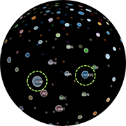
Big graphs are difficult to visualize because the scale of the data quickly results in complex network diagrams that can be difficult to decipher and have complicated interfaces with hundreds of options. Instead, we start by understanding what valuable nuggets we are trying to learn from this data, such as “Who’s connected to both me and my competition?” and “Did these people meet?” Starting from the question, we can then simplify the requirements and design effective visualizations that fit the problem. We will look at some mini-case studies and demos (e.g. Twitter correlation network, charity network).
