
Here at Uncharted, we create new kinds of visualizations, finding inspiration across diverse sources both contemporary and historic. We’ve been building our collection of interesting historic visualizations over the years and recently had the pleasure of poring over a copy of the atlas Gesellschaft und Wirtschaft by Isotype from the 1930s:
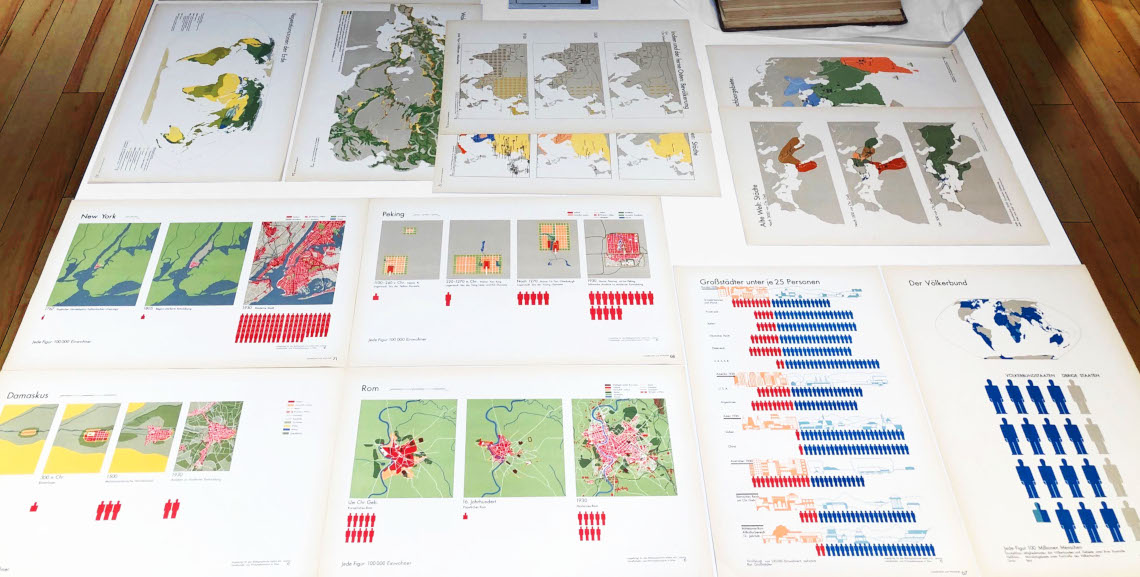
When designers talk about Isotype, they often focus on the impressive array of easily understood icons. But we found a lot more to marvel over seeing these charts in real life. Digital reproductions fail to capture the attentiveness paid to the finer qualities of ink on paper. Every color—vibrant, crisp and harmonious—jumps off the page. This ensures the perceptual clarity of the charts and, when combined with common semantic associations, optimizes the cognitive clarity as well. Unlike most contemporary applications of color theory, each color encoding activates physical or cultural visual memory to ease interpretation.
Another intriguing thing we noticed is the absolutely minimal use of text. Otto Neurath and team worked diligently to remove text and instead provide visual cues for the viewer. Not only does the chart below use simple icons to represent population, but the background scenes show the rural/urban splits while incorporating some visual motifs of the continents. The numeric axes have been replaced by thematic axes!
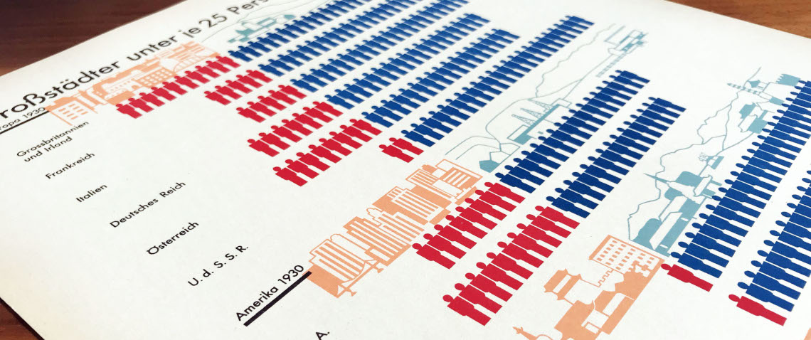
It’s a rare example where Isotype relaxed their normally minimalist use of ink to communicate a simple concept, but it got us thinking: how could thematic axes be relevant to visualizations today? It’s often other disciplines, eras, and mediums that gets us most excited about new possibilities and inspires new ideas.